Making Glyphs for Blockwick 2
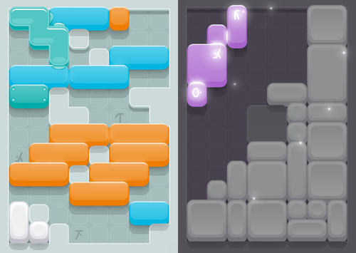
Those little symbols on the floor are called glyphs (pictured above on the left). If you can solve a puzzle (by bringing each color group together) and are able to get all three of the glyphs covered up with the color blocks you’ve achieved “illumination” (pictured above on the right).
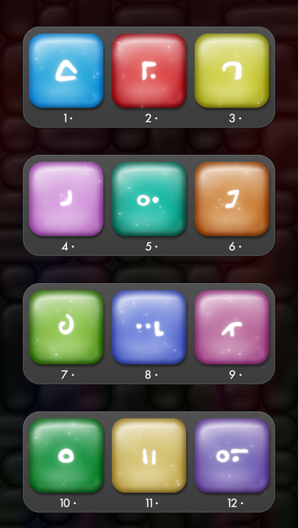
In the original game, Blockwick, we used glyphs to identify block type. There were 12 different block shapes, and each shape had it’s own specific color and glyph. Every chapter introduced another block shape with it’s own glyph, shown here:
The problem with having a glyph for every block shape in Blockwick 2 was that we substantially increased the number of shapes (from 12 to 70), so putting glyphs on every block type seemed overly impractical. Thus we came up with the idea of making the glyphs a little more integrated into the actual gameplay. Putting them on the floor adds an extra challenge, and another layer of replayability.
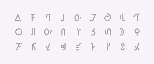
So when it came time to design the aesthetics of glyphs, we knew we wanted draw from the original game but obviously stay within the simpler minimalist framework of the new game. The original Blockwick’s glyphs have a soft, organic feel to them. They are hand drawn, a tad sloppy, but definitely still mysterious. Blockwick 2 is crisp and minimal. It’s cleaner with less fuss. An obvious reference point for us was the font Futura. We had used it in the original game and were planning on using it in the sequel. We still used the same symbols from Blockwick, but for Blockwick 2 they are cleaned up, geometric, and very much informed by Futura.
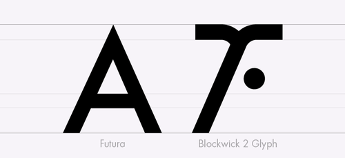
Above in this comparison you can see how Futura’s weight and simplicity inform the Blockwick 2 glyph. The glyphs do however maintain their own identity, specifically by their use of rounded corners and unique structures.
Blockwick 2 is coming out this Thursday, March 5th. Check out the trailer here.